Billion-Dollar Weather and Climate Disasters | USA The United States experiences a diverse range of climates due to its large size and varied geograph
Table of contents
The United States experiences a diverse range of climates due to its large size and varied geography. Major climate regions include:
Temperate Climate: Found on the East Coast and Midwest, with four distinct seasons and varying temperatures throughout the year.
Arid and Semi-Arid Climate: Seen in the Southwest and Great Plains, with hot summers, mild winters, and low precipitation.
Tropical Climate: Present in Southern Florida and Hawaii, featuring warm temperatures, high humidity, and frequent rainfall, especially during the wet season.
Mediterranean Climate: Seen in California and parts of Oregon, with mild, wet winters and dry, warm summers.
Continental Climate: Common in the Northern Plains and Midwest, characterized by cold winters with significant snowfall and hot, humid summers.
Mountain Climate: Found in the Rocky Mountains and Pacific Northwest, with varied climates based on elevation, including cooler temperatures and more precipitation at higher elevations.
Polar Climate: Occurs in northern Alaska and some northernmost states, featuring extremely cold winters and relatively cool summers.
These diverse climate patterns play a vital role in shaping various aspects of life in the USA, including ecosystems, agriculture, regional lifestyles and climate disaster management.
My data source for this data analysis is from source data.gov. Weather and Climate Billion-Dollar Disasters to Affect the U.S. from 1980–2023 (CPI-Adjusted). The grain of the data provided is at disaster event by date. Which I changed to the state level in tall form.
The dashboard location is given below:
Tableau Climate Disaster dashboard
Data Analysis
Bringing state information let me build maps with latitude and longitude, tableau works better with tall data compared with wider data. So I added the state information in the tall form.
The western part including California seems highly impacted by wildfire and drought.

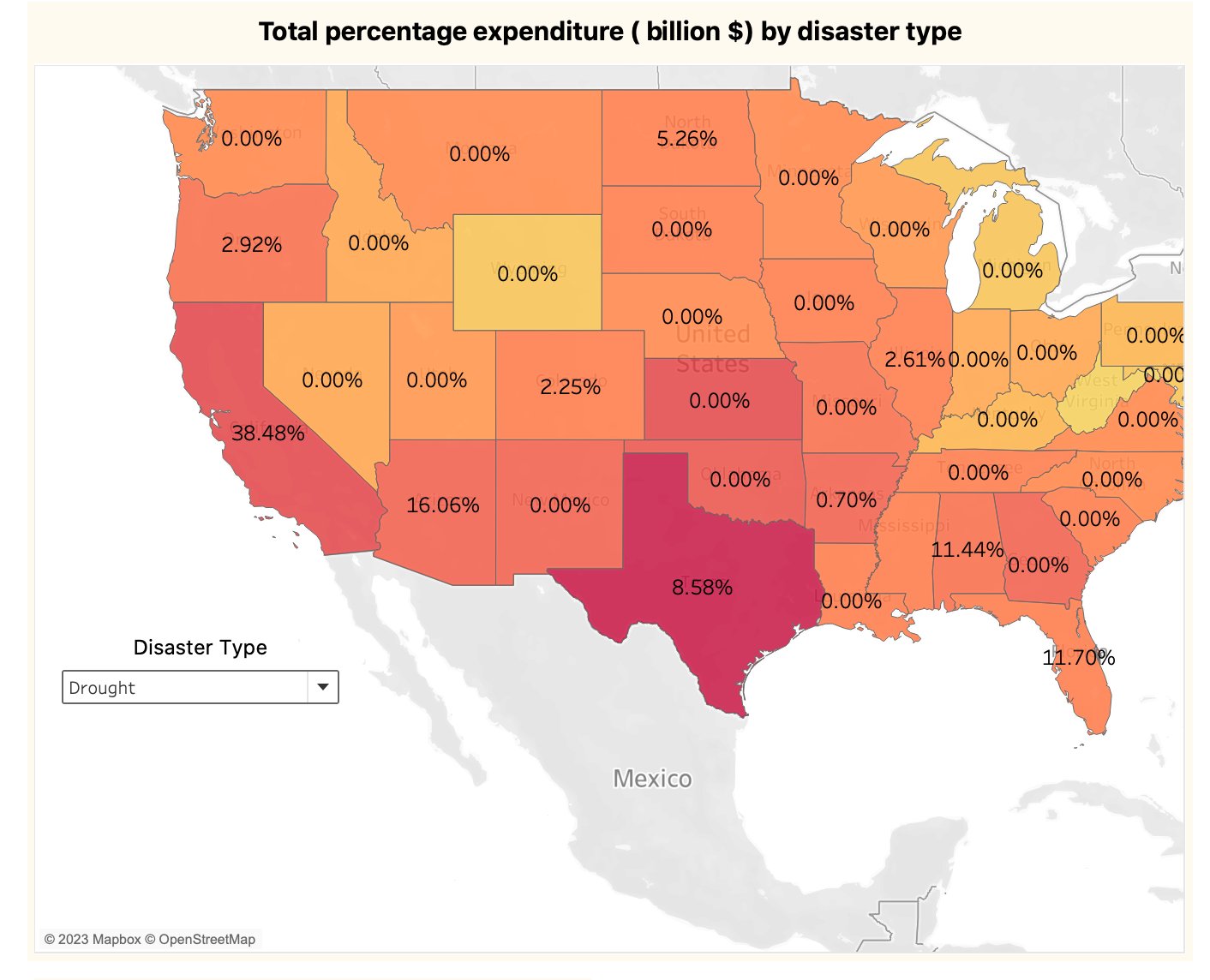
Whereas tornadoes and severe storms most impact the east part and Texas.

You can choose the disaster type from the drop-down in the live dashboard and observe different calamities impacting the geographic areas in the dashboard location provided above.
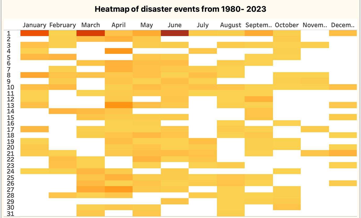
2. Performing time series analysis like Y0Y disaster events, cycle plot with variance and heat map shows a pattern of higher disaster events in spring and summer months. April is the most affected month.


- The intensity map displayed below illustrates the count of disasters in each state. The map highlights a higher occurrence of disasters on the eastern side, except California on the western side. Among the states, Texas stands out, enduring the highest number of disaster events at 134. It’s worth noting that the event numbers at the state level are not always absolute due to occasional data source categorizations, which may group states into regions like west, east, or central, and sometimes include specific states.

Tropical cyclones account for approximately half of the total expenditure at 52%. In the provided data, severe storms and tornadoes are combined, but I have separated tornadoes to analyze them individually.
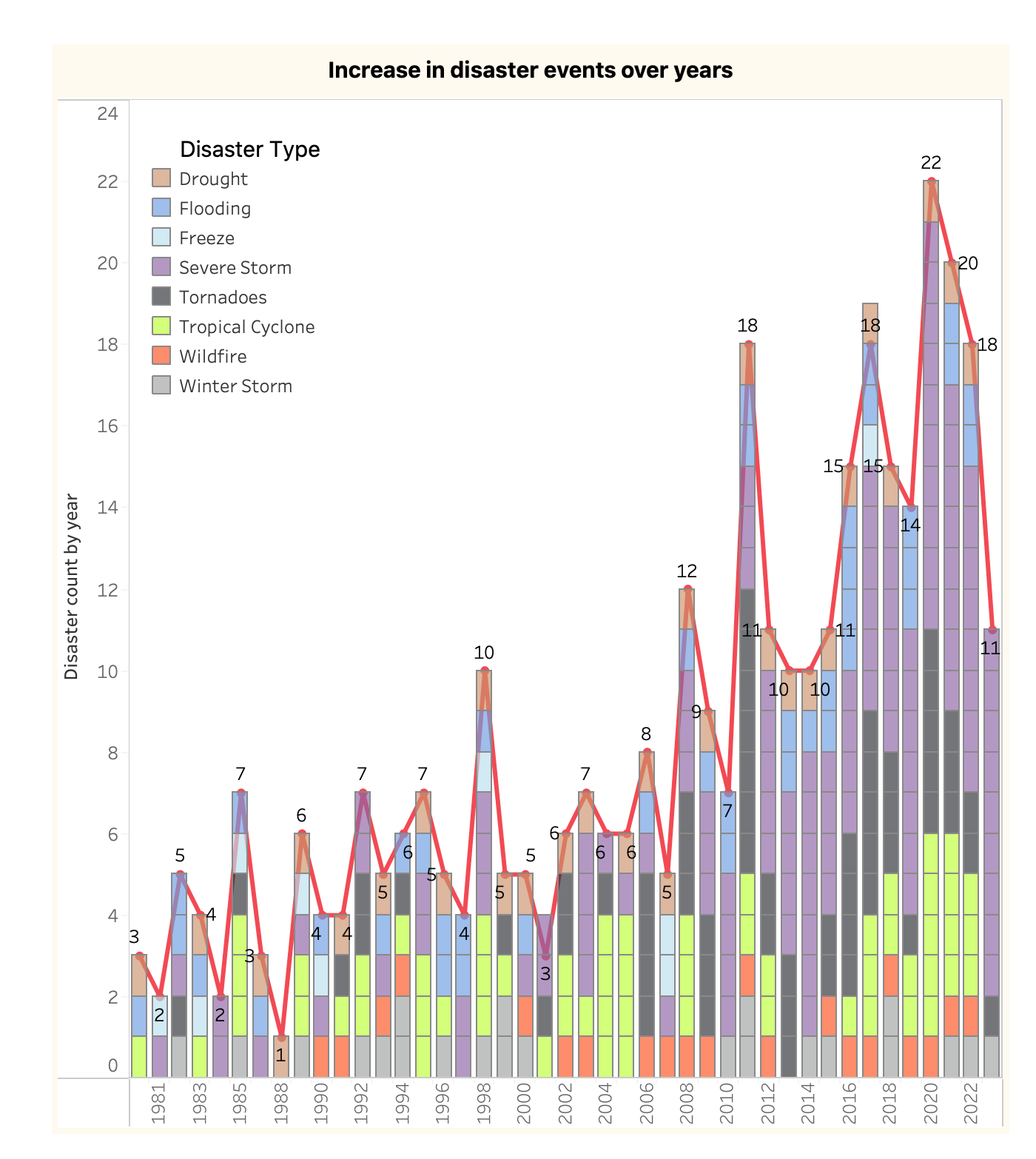
4. The data plot spanning from 1980 to 2023 reveals a noticeable rise in the number of disaster events after 2005. Over this period, all types of disasters have exhibited an increase, with severe storms showing a particularly prominent rise.
In conclusion, determining the exact cause for the surge in these disaster events based solely on the provided data is challenging. There could be several factors at play, such as:
Enhanced Monitoring and Reporting: The increase might be attributed to improved monitoring and reporting systems, leading to a more accurate recording of events.
Global Temperature Increase: Another potential cause could be the global rise in temperature. With the planet experiencing higher temperatures compared to previous times, it might be contributing to these catastrophic events.
To delve deeper into the analysis of causality, additional insights supported by data from other sources are necessary.
5. The most devastating events that took more than 100 lives are shown in the below graph.

Katrina (2005) and Maria (2017) claimed the maximum number of innocent lives.
Katrina brings back memories of meeting a couple in New Orleans who were profoundly affected by this calamity. I recall being in a room where this topic was brought up, and I could see the pain in their eyes. It was a moment of profound silence, and for the first time in my life, I truly understood the impact of such disasters on people’s lives. Catastrophic events like Katrina are relentless and unforgiving.
Reflecting on my encounters with shifting weather patterns, vivid recollections surface — like the discomfort of breathing in smoke-laden air and the advice to seek refuge indoors. I vividly remember watching news reports on TV, bearing witness to wildfires and floods occurring just a few counties away in California, occurring almost every other year, if not consecutively.
Over the past three summers, I spent time in various locations in northern and eastern India. In each place, I felt as though I was within an unrelenting furnace that only cools down around 1:00–2:00 AM (while experiencing the extreme temperature I used to contemplate the usage of concrete as a building material for such hot climates housing material needs to be chosen and design according to climatic conditions and innovation is required in this field), with temperatures hovering around 120°F for several consecutive months.
Upon returning to the Bay Area last September, I encountered months of rain, leading to eventual flooding. This stark contrast to my previous decades of experiencing seasons in both countries underscores the fact that these events are no longer distant occurrences observed in textbooks or on television; they are part of our own lives.
The belief I hold is that advancements in AI, ML, and various other fields can contribute to the creation of more effective monitoring and alert systems through forecasting. This, in turn, can facilitate the development of precautionary measures. The world uniting as one and allocating resources to construct systems that provide alerts — not just in the weeks but months preceding a disaster event — could potentially save numerous lives. These robust systems could safeguard not only human lives and their pets but also extend to the wildlife that shares our planet.
For wildlife, especially in the face of wildfires, there might be an opportunity to create designated disaster zones within their natural habitats. These areas could have berms and water bodies, void of trees, offering shelter during wildfires, and allowing creatures to return once the danger has passed. While I recognize these notions might seem aspirational wishful thinking and challenge due to various reasons, with ample expertise in these areas, tangible solutions might be achievable.
Another observation is the increase in recent drought events, some of which extend for nearly a year, leading to droughts and wildfires. Further details can be explored in the dashboard available at the provided link.
Data preparation and enhancement
I made the following changes as part of data preparation and enhancement:
I changed the grain to the state level, I resorted to Excel functions and mostly manual enhancement because for analysis of state information I felt was critical. I form / deep because the rows provided were 357 and by exploding to state level it grew up ~3000 which is insignificant for any analytical tool, especially for tableau which I am using.
In essence, my lowest grain is state but for the amount, deaths and events cumulative field it’s one level above because this information is missing at the state level.
Calculated the number of disaster days because begin and end date was available. This field gave many insights which I discussed in the analysis section.

4. Converted $ (dollar) amount to billion for uniformity using table calculation in Tableau. All these calculated fields are available for download in the tableau workbook @ <link >

5. Another Metric I was interested in the max days an event was active.

6. For the tooltip I extracted the event name for this max days event using.

7. Event Type for this max days event calculation.
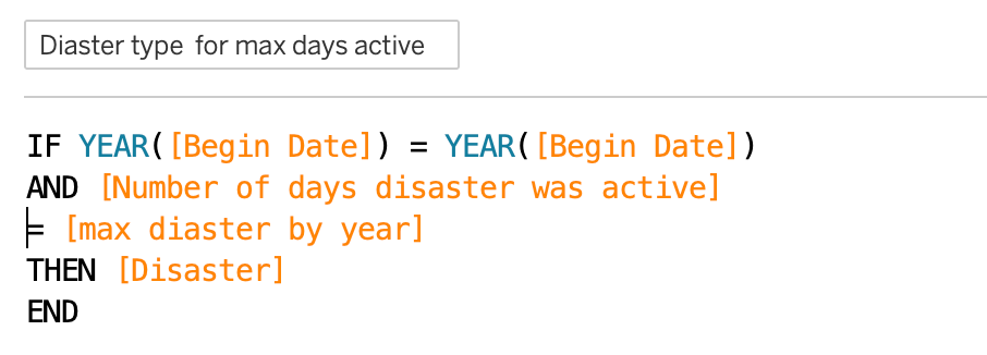
Similar to the above calculation I extracted events that caused maximum deaths, type and name events. (available for download) @ <link>
9. Since I changed the grain to state, I needed event count at a higher level

Data validation
a. Using Tableau
- For simpler validation bringing metrics and dimensions on the card and creating a table in Tableau is a good way for spot-checking example.

2. I am using table calculations for % the total of amount across each state.

b. Using SQL as a tool for validation
SQL is a good tool for verifying your matrixes. I am using Postgres ( you can find the insert SQL script in the GitHub location given below)
All the code can be found at Github location:
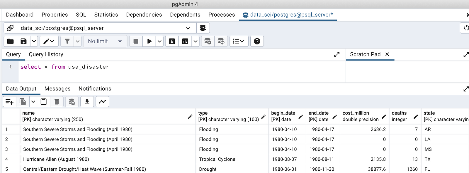
- Natural climate disaster from 1980 to 2023.
SELECT  state , COUNT(1) as disaster_count
  FROM usa_disaster
GROUP BY state
ORDER BY disaster_count DESC

2. Which disaster event was active more than 90 days in a given year?
WITH max_days AS (
    SELECT
        DATE_PART('year', begin_date) AS yr,
        MAX(end_date - begin_date) AS max_days
    FROM
        usa_disaster
    GROUP BY
        DATE_PART('year', begin_date)
),
description AS (
    SELECT
        DISTINCT name,
        type,
        begin_date,
        end_date,
        (end_date - begin_date) AS days,
        DATE_PART('year', begin_date) AS yr
    FROM
        usa_disaster
)
SELECT *
  FROM description
WHERE
    (days, yr) IN (SELECT max_days, yr FROM max_days)
    AND days >= 90
ORDER BY
    yr DESC;

3. Total sum of $(dollar) expenditure in events.
SELECT
   ROUND(SUM(cost_million/1000)) AS total_cost_billion
FROM usa_disaster;

4. Which disaster event claim at least 100 lives?
WITH max_deaths AS (
    SELECT
        DATE_PART('year', begin_date) AS yr,
        MAX(deaths) AS max_deaths
    FROM
        usa_disaster
    GROUP BY
        DATE_PART('year', begin_date)
),
description AS (
    SELECT
        DISTINCT name,
        type,
        deaths,
        DATE_PART('year', begin_date) AS yr
    FROM
        usa_disaster
)
SELECT *
  FROM description
WHERE
    (deaths, yr) IN (SELECT max_deaths, yr FROM max_deaths)
     AND deaths >= 100
ORDER BY yr;

6. Percentage (%) Dollar expenditure in billion by disaster type.
WITH total_sum AS (
SELECT
   ROUND(SUM(cost_million/1000)) AS total_cost_billion
FROM usa_disaster
),
disaster_sum AS (
SELECT
   type AS Disaster_type,
   ROUND(SUM(cost_million/1000)) AS total_cost_billion
FROM usa_disaster
GROUP BY type
)
SELECT
   Disaster_type,
   ROUND(CAST(total_cost_billion/(select * FROM total_sum) * 100 AS numeric),2) AS percentage_total
FROM  disaster_sum
ORDER BY percentage_total DESC

If you found this enjoyable, consider following for more content in the future!
If establishing a connection interests you, you can find my LinkedIn profile at the following link: https://www.linkedin.com/in/arunadas29/
